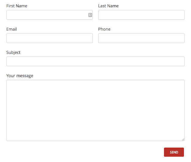
In this tutorial, we will see how to create a 2-column responsive form with contact form 7 WordPress Plugin. The form will be visible in two columns on bigger screens / Tablets and will become one column on mobile devices.
Contact form 7 is one of the most popular and most downloaded WordPress plugins to create a contact form for your WordPress website. and the main issue of responsive contact form in 2 columns will solve this article.
Our final form will look like the following.

Table of Contents
Creating a 2-Column Responsive Form with Contact form 7 WordPress Plugin
To create a responsive 2 column form for the Contact Form 7 plugin, You need to add 2 codes: HTML Markup and CSS Style. combinations of these 2 below codes with giving you the desired output. Let's see how???
HTML Markup
Let’s create the HTML markup for the form first. We will wrap the whole form with an ID named “responsive-form” and then will have rows and columns like the following:
<div id="responsive-form" class="clearfix">
<div class="form-row">
<div class="column-half">First Name [text* first-name]</div>
<div class="column-half">Last Name [text* last-name]</div>
</div>
<div class="form-row">
<div class="column-half">Email [email* your-email]</div>
<div class="column-half">Phone [text* your-phone]</div>
</div>
<div class="form-row">
<div class="column-full">Subject [text* your-subject]</div>
</div>
<div class="form-row">
<div class="column-full">Your message  [textarea your-message]</div>
</div>
<div class="form-row">
<div class="column-full">[submit "Send"]</div>
</div>
</div><!--end responsive-form-->
CSS Styles
Let’s look at the CSS styles for our two-column grid.
#responsive-form{
 max-width:600px /*-- change this to get your desired form width --*/;
 margin:0 auto;
        width:100%;
}
.form-row{
 width: 100%;
}
.column-half, .column-full{
 float: left;
 position: relative;
 padding: 0.65rem;
 width:100%;
 -webkit-box-sizing: border-box;
        -moz-box-sizing: border-box;
        box-sizing: border-box
}
.clearfix:after {
 content: "";
 display: table;
 clear: both;
}
/**---------------- Media query ----------------**/
@media only screen and (min-width: 48em) {
 .column-half{
  width: 50%;
 }
}
Let’s style the form now.
.wpcf7 input[type="text"], .wpcf7 input[type="email"], .wpcf7 textarea {
 width: 100%;
 padding: 8px;
 border: 1px solid #ccc;
 border-radius: 3px;
 -webkit-box-sizing: border-box;
  -moz-box-sizing: border-box;
       box-sizing: border-box
}
.wpcf7 input[type="text"]:focus{
 background: #fff;
}
.wpcf7-submit{
 float: right;
 background: #CA0002;
 color: #fff;
 text-transform: uppercase;
 border: none;
 padding: 8px 20px;
 cursor: pointer;
}
.wpcf7-submit:hover{
 background: #ff0000;
}
span.wpcf7-not-valid-tip{
 text-shadow: none;
 font-size: 12px;
 color: #fff;
 background: #ff0000;
 padding: 5px;
}
div.wpcf7-validation-errors {
 text-shadow: none;
 border: transparent;
 background: #f9cd00;
 padding: 5px;
 color: #9C6533;
 text-align: center;
 margin: 0;
 font-size: 12px;
}
div.wpcf7-mail-sent-ok{
 text-align: center;
 text-shadow: none;
 padding: 5px;
 font-size: 12px;
 background: #59a80f;
 border-color: #59a80f;
 color: #fff;
 margin: 0;
}
With these styles applied the form will look a lot nicer. On the desktop it will be displayed in two columns and in a mobile device, it will be displayed in one column.
This is a complete tutorial on How to Create a Two-Column Responsive Form with Contact form 7 WordPress Plugin. If you have any questions, please let me know in the comments.
READ MORE:
- How to Create a WordPress Website, Blog and eCommerce Store.
- How to Add Mailchimp Form in Facebook Page | Increase Email List's Subscribers
- 30+ Free Tools for Social Media and Community Management Resources


9 Comments
Excellent solution – thank you
This is an awesome post. Really very informative and creative contents.
Thanks!
https://cbdoilamericano.com/# cbd oil for sale
cbd pills
cbd oil colorado
You can actually achieve this using a plugin now,
Hi Anant
Sorry by my knowledge, where i put this information to make this form go up
Hi Frenando,
Great Thanks for your doubts. You need to replace the “HTML Code” in “Form tab” and place “CSS Code” in the “Additional Setting tab” and save. that’s it.
great work bro
Thanks, Mohd Imran!