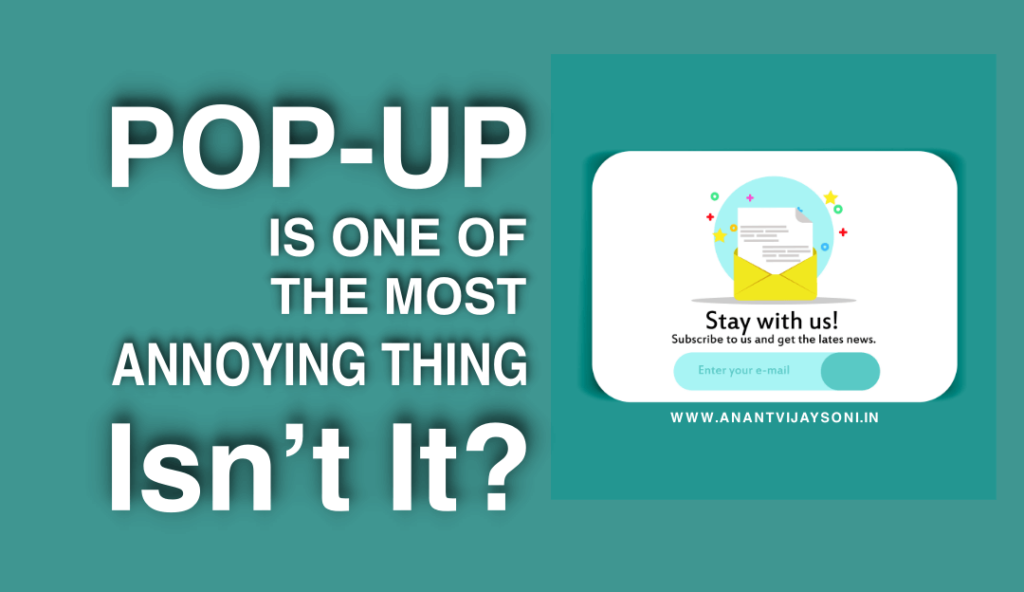
Pop-ups is a form of online advertising on the World Wide Web. A pop-up window is a graphical user interface (GUI) display area, usually a small window, which appears suddenly (“pop-up”) in the foreground of the visual interface. The pop-up window that contains an “advertisement” or a “call to action” is usually generated by JavaScript that uses cross-site scripting (XSS), sometimes with a second load that uses Adobe Flash. They can also be generated by other vulnerabilities/security holes in browser security.
A variation in the pop-up window, the pop-up ad, opens a new browser window below the active window. Pop-unders do not interrupt the user immediately but appear when the user closes the coverage window, which makes it difficult to determine which website created them.
As per my view, pop-ups are one of the most annoying things that can stress your readers. The post got great responses from bloggers and many of them disagreed with my point about pop-ups.
They think that It’s really almost foolishness not to use popup because It converts well, but I say that It’s almost foolishness to use pop-up and I’ll tell you the reason below.
Table of Contents
It’s converting well for some bloggers
Personally, I don’t like pop-ups, but I’ve also seen that It’s converting well for some bloggers and website owners have the right to use whatever techniques they want.
Some blogs have the right to use a pop-up like John Chow or Neil Patel on QuickSprout because those are already established blogs and have a great audience. The popup they’re using is awesome and attention grabby, so making sure that pop-up isn’t breaking your blog is a must.
If you’ve just started a blog and you have just got few readers than you should not use a pop-up on your blog to annoy them.
The reason why bloggers use pop-ups is that the conversion is incredibly high and is converting well for them, It’s a way to get more newsletter subscribers for them, but the annoyance factor is also high which you need to keep in mind.
You need to take into consideration the people that are getting annoyed with the popup and quite the site to never visit again.
Provide quality content
Popup is one of the most annoying promotion forms. You should not take the risk of annoying your readers with pop-ups, instead, you should try to provide quality content to your readers.
If you have a quality and useful content on your blog that can touch the heart of your readers, they’ll subscribe to you. You don’t really need to use pop-ups.
You convince them, they’ll subscribe you! click to tweet
The best example is Daniel Scocco’s Daily Blog Tips. Daniel has more than 40,000 email subscribers and he convinced them with his content.
I love Daniel’s blog because of Its simplicity. He never used auto-popups or any other risky techniques to increase the number of subscribers.
Pop-ups are obnoxious
The pop-up which appears on a blog when I first visit is really obnoxious. If I haven’t read the content yet, I’m not going to subscribe to it. I’ll leave the website and will never come back.
I find the pop-ups a joke, some people even hide the “close” button on the popup, I get so frustrated that I leave the site.
36% says YES:
Long time ago, Daniel had run a poll on his blog asking from his readers that “Would one pop-up offering you a newsletter subscription be enough to make you stop visiting a website?”
The result of the poll was something like:
- 36% said YES
- 64% said NO
That means If you use a pop-up on your blog at least 36% of your readers will stop visiting your blog again. So, better I don’t use pop-up because as a blogger, my readers means a lot to me and I don’t want to annoy and lose even 1% of readers.
Your Turn:
Do you still think pop-ups are useful?
Do you want 36% of your readers to stop visiting your blog again?
I would love to hear from you on this!


